
A control chart is a time-ordered graph of process data with a centerline and statistically calculated control limits. Its entire job is to answer one question every time a new point is plotted: is this the same ordinary variation the process always has, or is something different happening that deserves investigation?
Most of what goes wrong with SPC in practice has nothing to do with the math. Teams pick the wrong chart for their data type, treat control limits as if they were specification limits, or adjust a stable process every time a point wobbles — which, per Shewhart and Deming's own findings, makes the process worse, not better. This guide covers chart selection, the actual formulas behind the limits, a full worked example by hand, and the rules used to separate a real signal from noise.
Open the Control Limits Generator Read the Control Charts BoK entry
Why Control Charts Matter
Every process has variation. The question SPC exists to answer is whether that variation is the ordinary, expected kind — built into the process and affecting every unit — or a special kind, traceable to something specific that changed.
Stops Overreaction
Without a control chart, people adjust the process every time a point moves, which adds variation instead of removing it.
Stops Underreaction
A real shift can hide inside normal-looking noise until a chart's rules flag the pattern.
Separates Two Different Jobs
Common-cause variation needs a system change; special-cause variation needs an investigation. Confusing the two wastes both kinds of effort.
Feeds Capability Studies
A capability study only means something once the chart shows the process is stable. An unstable process has no single capability to measure.
Core Terms
| Term | Meaning |
|---|---|
| Common-cause variation | The ordinary, expected scatter built into a stable process. Present in every output, not traceable to one event. |
| Special-cause variation | Variation traceable to something specific and identifiable, such as a tool change, a bad material lot, or an operator error. |
| Centerline (CL) | The process average, typically the grand average of all subgroup values used to build the chart. |
| Upper/lower control limit (UCL/LCL) | Lines placed at roughly ±3 standard deviations from the centerline, marking the boundary of expected common-cause variation. |
| Subgroup | A small set of consecutive units, measured together, used as one plotted point on a variables chart. |
| Rational subgrouping | Choosing subgroup composition so that variation within a subgroup reflects only common causes, leaving between-subgroup variation to reveal special causes. |
| In control | A process showing only common-cause variation, with no points or patterns violating the chart's rules. |
Choosing the Right Chart
Chart selection comes down to two questions: what type of data is being measured, and how the data is sampled. Get this step wrong and every calculation downstream is wrong with it.
Answer the same two questions interactively in the Control Chart Selector, which also covers the X-bar/S chart for larger subgroups (n>10) not shown in the table below.
| Data type | Sampling | Chart | Typical use |
|---|---|---|---|
| Continuous (variables) | Subgroups of n = 2–10 | X-bar / R | Dimension, weight, temperature, cycle time measured in rational subgroups. |
| Continuous (variables) | Individual readings, n = 1 | I-MR | Low-volume production, destructive testing, or one reading per batch/day. |
| Attribute, defective units | Constant sample size | np | Count of defective units per fixed-size sample. |
| Attribute, defective units | Varying sample size | p | Proportion defective when lot or sample size changes lot to lot. |
| Attribute, defect count | Constant inspection area/unit | c | Count of defects on a fixed unit, such as blemishes per panel. |
| Attribute, defect count | Varying inspection area/unit | u | Defects per unit when unit size or area varies. |
How the Limits Are Calculated
Control limits are built from the process's own average variation, not from a target or a specification. For an X-bar/R chart, the average subgroup range (R-bar) estimates common-cause variation, and a table constant converts that estimate into limits around the average.
| Subgroup size (n) | A2 | D3 | D4 |
|---|---|---|---|
| 2 | 1.880 | 0 | 3.267 |
| 3 | 1.023 | 0 | 2.575 |
| 4 | 0.729 | 0 | 2.282 |
| 5 | 0.577 | 0 | 2.115 |
| 6 | 0.483 | 0 | 2.004 |
| 7 | 0.419 | 0.076 | 1.924 |
| 8 | 0.373 | 0.136 | 1.864 |
| 9 | 0.337 | 0.184 | 1.816 |
| 10 | 0.308 | 0.223 | 1.777 |
For attribute charts, the limits come from the binomial or Poisson distribution instead of the range: a p chart uses CL = p-bar and UCL/LCL = p-bar ± 3√(p-bar(1−p-bar)/n), which is why its limits widen or narrow as sample size n changes lot to lot. A c chart uses CL = c-bar and UCL/LCL = c-bar ± 3√c-bar.
The Control Limits Generator runs all five of these formulas (X-bar/R, p, np, c, u) directly from entered subgroup data, so the hand calculations below are worth doing once to understand the mechanics, not every time in practice.
Worked Example: Ridgeline Precision Machining
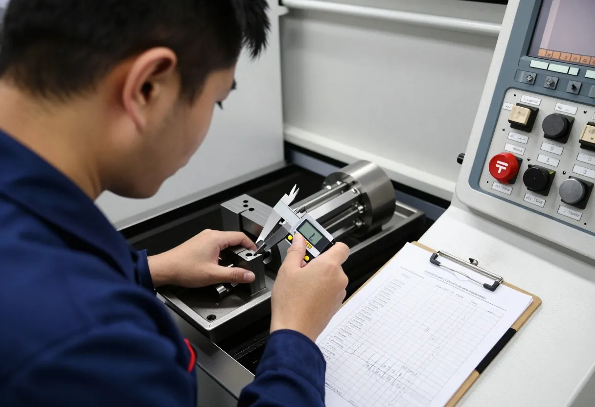
Ridgeline Precision Machining bores a housing to a 25.000 mm target diameter. A machinist measures 5 consecutive parts every hour and logs 20 subgroups before calculating trial control limits.
- Across the 20 subgroups (n = 5), the grand average is X-double-bar = 25.002 mm.
- The average subgroup range is R-bar = 0.018 mm.
- For n = 5, A2 = 0.577, so the X-bar limits are 25.002 ± (0.577 × 0.018) = 25.002 ± 0.0104.
- X-bar chart: CL = 25.002 mm, UCL = 25.012 mm, LCL = 24.992 mm.
- For n = 5, D4 = 2.115 and D3 = 0, so UCLR = 2.115 × 0.018 = 0.038 mm and LCLR = 0 mm.
On subgroup 14, the average diameter jumps to 25.015 mm — above the 25.012 mm UCL. The machinist checks the tool log: an insert was changed two subgroups earlier. That is a textbook special cause, not noise, and it gets investigated and corrected before more parts are cut, not averaged away into the next capability study.
Detecting Special Causes: The Western Electric Rules
A point beyond the control limits is the most obvious signal, but it is not the only one. Patterns that are individually inside the limits can still be statistically unlikely enough to investigate. The classic Western Electric rules divide the space between the centerline and each control limit into three equal zones — A (2σ to 3σ), B (1σ to 2σ), and C (centerline to 1σ) — and flag specific patterns within them.
| Rule | Pattern | What it suggests |
|---|---|---|
| 1 | 1 point beyond Zone A (past 3σ) | A likely special cause, the classic out-of-control signal. |
| 2 | 2 of 3 consecutive points in Zone A or beyond, same side | A sustained shift building near the limit. |
| 3 | 4 of 5 consecutive points in Zone B or beyond, same side | A smaller but persistent shift in the process average. |
| 4 | 8 consecutive points on the same side of the centerline | A shift too gradual to trip the other rules but real enough to matter. |
Control Limits Are Not Specification Limits
This is the single most common SPC mistake, and it runs in both directions. Control limits come from the process; specification limits come from the customer or the drawing. They have no mathematical relationship to each other unless someone deliberately checks.
| Control limits | Specification limits | |
|---|---|---|
| Source | Calculated from the process's own data | Set by the customer, drawing, or design requirement |
| Answers | Is the process behaving the way it usually does? | Is this part acceptable to ship? |
| Can move | Only when the process genuinely changes and stabilizes | Only when the requirement changes |
| A point outside means | Investigate for a special cause | The part may be nonconforming |
In the Ridgeline example above, the 25.012 mm UCL is not a tolerance — it is where this specific process's own variation predicts the average will land 3-in-1,000 subgroups by chance alone. If the print tolerance were 25.000 mm ±0.030 mm, subgroup 14 would still be well inside spec even while it is out of statistical control. Both facts are true at once, and both matter for different reasons.
Rational Subgrouping
The chart is only as good as the subgroups feeding it. Rational subgrouping means choosing which units go into the same subgroup so that variation within a subgroup reflects only common causes, leaving variation between subgroups to carry any special-cause signal.
- Sample consecutively, not randomly across a shift. Five parts made back-to-back reflect the same momentary process state; five parts pulled from across an 8-hour shift blend multiple states into one subgroup and hide shifts instead of revealing them.
- Match subgroup frequency to how fast the process can change. A process that can drift within an hour needs hourly subgroups, not once-per-shift sampling.
- Do not mix sources inside a subgroup. Combining output from two machines, two operators, or two material lots into one subgroup buries a real between-source difference inside what looks like common-cause noise.
What to Do When a Point Signals
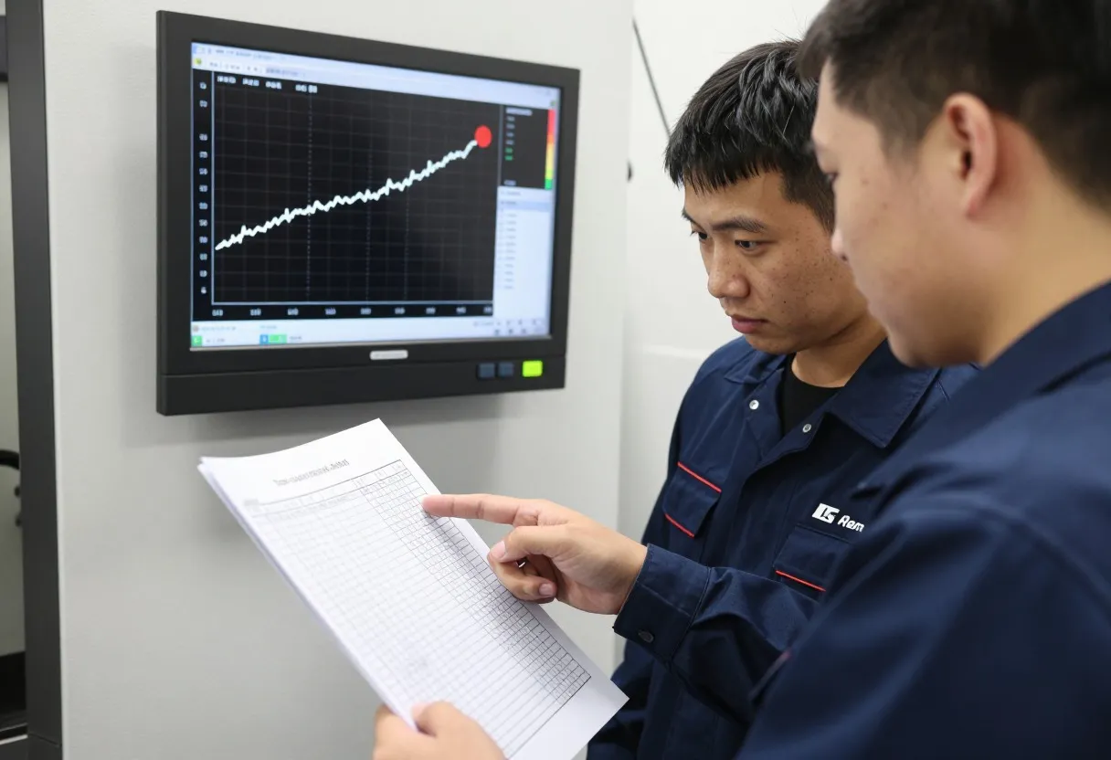
- Do not adjust the process yet. Confirm the signal is real before touching a setting.
- Check the timeline first. Tool changes, material lot changes, shift changes, and maintenance events are the first things to rule in or out.
- Investigate the specific cause, not a general impression of "something's off."
- Correct the identified cause, then continue charting to confirm the process returns to its normal pattern.
- Recalculate limits only after a real, confirmed process change — never simply because the current limits feel inconvenient.
Common Mistakes
Wrong Chart for the Data
Running a p chart on constant-sample-size data (where np would do) or a variables chart on attribute data produces limits that don't mean what they appear to mean.
Recalculating Limits Too Often
Rebuilding limits every time a new batch of data comes in can hide a real, meaningful shift inside limits that keep chasing the data.
No Documented Reaction Plan
A chart with no defined response to a signal is a wall decoration, not a control system.
Treating the Chart as the Whole System
A chart tells you when to look. It does not replace root-cause investigation, measurement system analysis, or process knowledge.
Quick Reference
Setup Checklist
- Chart type matches the data type and sampling method.
- Subgroups are rational: consecutive, consistent frequency, single source.
- At least 20-25 subgroups collected before trial limits are calculated.
- Measurement system has been verified, not assumed.
Operating Checklist
- Points are plotted as they occur, not batched after the fact.
- A documented reaction plan exists for out-of-control signals.
- Limits are recalculated only after a confirmed, stabilized process change.
- Chart events (tool changes, lot changes, shifts) are annotated on the chart.
Sources and Further Reading
- Walter A. Shewhart, Economic Control of Quality of Manufactured Product.
- W. Edwards Deming, Out of the Crisis.
- Douglas C. Montgomery, Introduction to Statistical Quality Control.
- AIAG Statistical Process Control (SPC) Reference Manual.
- ASQ Certified Quality Engineer Body of Knowledge.