
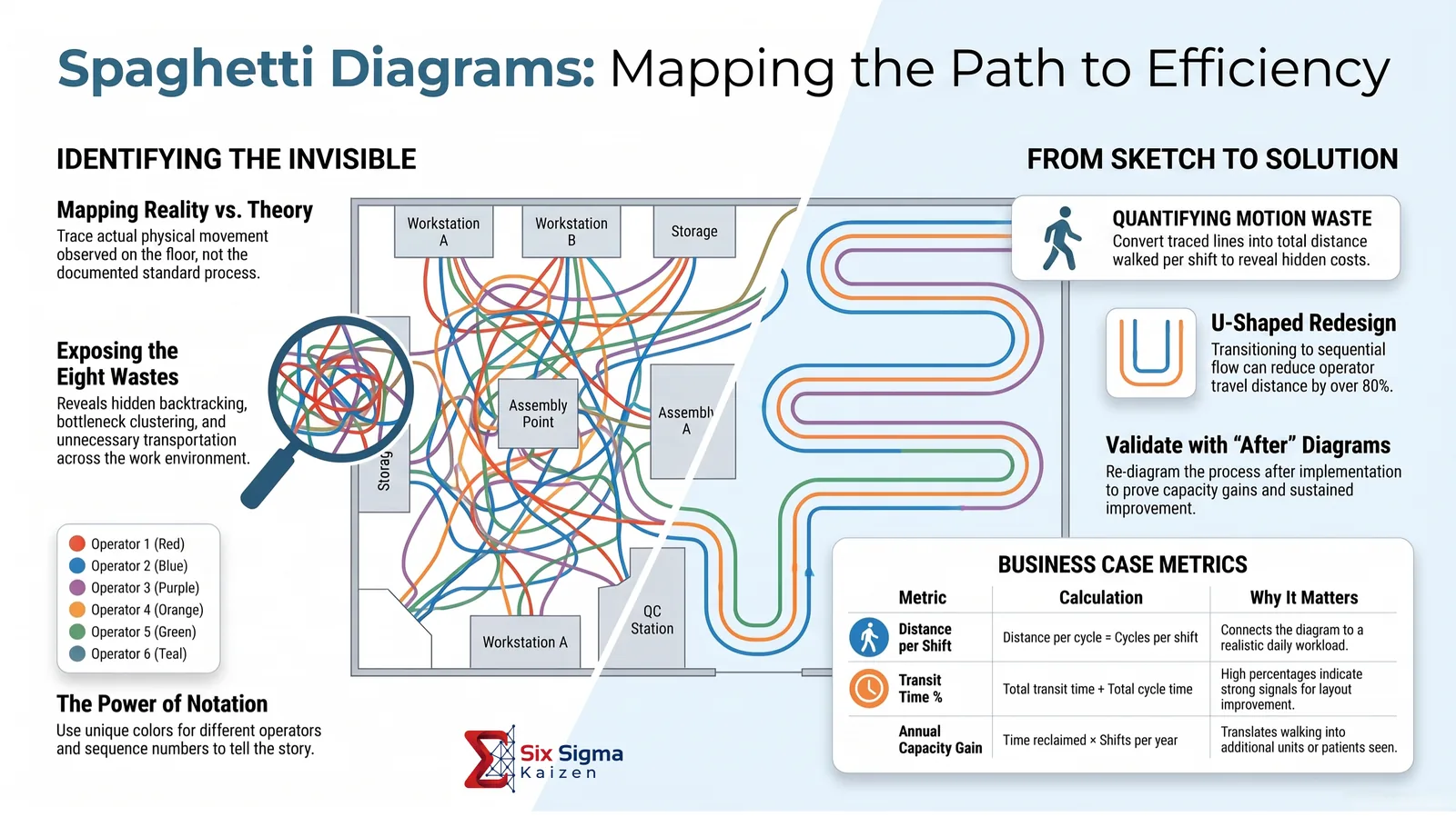
A spaghetti diagram is a visual map of the actual physical movement of a person, part, document, or piece of information as it travels through a process. The tangled path is the point: it makes waste visible in a way a written procedure or high-level process map cannot.
Where a value stream map shows process sequence and information flow, a spaghetti diagram shows the physical distance and layout reality behind the work. Two processes can look the same on paper while one requires 40 feet of walking per cycle and the other requires 400.
What Is a Spaghetti Diagram?
A spaghetti diagram traces every trip an operator, nurse, picker, clerk, part, or paperwork packet actually takes across a layout during an observation period. When those trips are drawn over a floor plan, the result often looks like a plate of spaghetti: crossing, overlapping, and looping lines that show where motion and transport waste have accumulated.
This guide walks through the tool from first principles: where it came from, how to build one correctly, how to turn a messy line drawing into hard data, how to apply it across manufacturing, healthcare, office, and warehouse settings, and how it fits into the broader Lean Six Sigma toolkit.
What a Spaghetti Diagram Reveals
- Excess travel distance: The literal number of feet or meters walked per cycle, shift, or unit produced.
- Poor layout design: Workstations, storage, or departments placed in an order that does not match the real work sequence.
- Backtracking: Repeated returns to the same location because a resource, tool, material, or information point is not where it is needed.
- Bottleneck clustering: Multiple paths converging on a shared printer, supervisor, tool crib, inspection station, or other constrained resource.
- Handoff waste: Frequent trips between people or departments that could be eliminated by relocating or resequencing work.
- Layout redesign opportunities: The current-state trace becomes the design canvas for a better, tighter flow.
Section 1: Origins and Purpose of the Tool
Where the Tool Comes From
Spaghetti diagramming traces its roots to the motion study work of Frank and Lillian Gilbreth, who showed that physical movement itself could be observed, mapped, and systematically reduced as a category of waste. Their therbligs and chronocyclegraphs were early ancestors of the modern spaghetti diagram.
The tool was later formalized and popularized through the Toyota Production System and broader Lean manufacturing practice. It became a standard way to expose the motion waste category during kaizen events and layout redesign work. Today it also applies in healthcare, office processes, warehousing, retail, hospitality, and any environment where layout shapes how work happens.
The Problems It Solves
| Problem | How the Diagram Helps |
|---|---|
| Layout designed around departments, not flow | Visualizes actual movement, exposing mismatch between layout and process sequence. |
| Assumptions about where waste exists | Converts opinion into observable, countable, repeatable data. |
| New or cross-trained staff struggle to explain inefficiency | Creates a shared visual language that does not depend on tenure or vocabulary. |
| Leadership is skeptical that extra walking matters | Aggregates small trips into total distance and time that are difficult to dismiss. |
| A redesign proposal needs buy-in | Uses the same visual tool to diagnose the problem, design the solution, and explain the case. |
When to Use a Spaghetti Diagram, and When Not To
A spaghetti diagram earns its place when the improvement question is physical movement. Choosing the right tool for the right question keeps teams from forcing one map to answer every process problem.
| Tool | Best For | Not Ideal For |
|---|---|---|
| Spaghetti Diagram | Travel distance, layout problems, motion waste, and cell design | Decision logic or information flow without physical movement |
| Value Stream Map | End-to-end process flow, lead time, information flow, and value-added time | Physical layout detail or exact walking distance |
| Process Flowchart | Decision points, branching logic, and ownership sequence | Distance, layout, or movement intensity |
| Time and Motion Study | Precise cycle-time and micro-motion analysis at one workstation | Whole-cell or multi-station travel patterns |
Section 2: Notation and Symbols
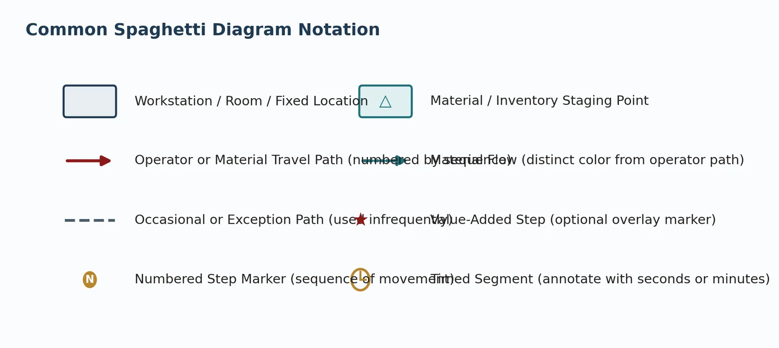
Spaghetti diagrams do not have a universal standard the way engineering schematics do, but a small and consistent notation makes diagrams easier to read, compare, and hand off between teams.
Typical notation includes: fixed locations, numbered travel legs, exception paths, staging points, operator travel, material travel, value-added stops, and timed segments.
Notation Best Practices
- Use a different color per person or part tracked, especially when overlaying multiple operators or part numbers on one layout.
- Number every leg in the sequence it actually occurred, not the sequence the team expected.
- Distinguish operator travel from material travel with different line styles when both matter.
- Mark exception or rare paths differently from routine paths so the diagram does not overstate unusual trips.
- Keep the floor plan simple: walls, major equipment, doors, storage, and key fixed locations are usually enough.
Section 3: How to Create a Spaghetti Diagram
Building a useful spaghetti diagram is a discipline, not just a sketching exercise. The steps below take a team from initial scope through a validated, data-backed diagram ready to support a layout decision.
- Define the scope and observation window. Decide exactly what you are tracking and for how long: one operator, one part number, one document type, one cycle, one hour, or one shift.
- Obtain or draw an accurate floor plan. Use a facilities drawing, CAD layout, or hand-measured sketch. The drawing does not need to be elegant, but it must support distance estimates.
- Observe and trace actual movement. Stand in the space or review video and trace every trip as it happens. Do not diagram what the standard work says should happen.
- Number each leg of the path. Add sequence numbers so the diagram tells the story of the observation period in order.
- Repeat the observation. A single cycle can be an outlier. Observe multiple cycles, shifts, or operators where practical.
- Calculate distance and time. Convert the trace into total distance, number of trips, time in transit, and time spent adding value.
- Identify waste patterns. Look for backtracking, crossing paths, long single trips, searching, and recurring trips to shared resources.
- Redesign, then re-diagram. Use the same notation to compare current state, proposed state, and the actual post-implementation result.
Section 4: Turning the Diagram into Data
The picture gets attention in the room; the numbers get budget approved. Quantitative analysis separates a compelling visual from a rigorous improvement case.
Calculating Total Travel Distance
Using a scaled floor plan, measure each traced leg and sum the distance for the observation period. Then multiply by cycles per shift, shifts per day, and annual operating days to translate one observation into daily or yearly impact.
| Metric | Example Calculation | Why It Matters |
|---|---|---|
| Distance per cycle | Sum of all traced leg lengths for one part, patient, or transaction | The base unit every other calculation scales from |
| Distance per shift | Distance per cycle x cycles completed per shift | Connects the diagram to a realistic daily workload |
| Distance per operator per year | Distance per shift x shifts worked per year | Supports ergonomics, staffing, and layout discussions |
| Percent of cycle time spent walking | Total transit time / total observed cycle time | Compares movement waste directly against value-added time |
Overlaying Time on the Diagram
Distance alone tells only part of the story. A short walk through a congested or obstructed route can consume more time than a longer clear path. Add simple stopwatch timing to each numbered leg and separately record time spent working, waiting, searching, or transporting.
Mapping Travel Patterns to the Eight Wastes
| Waste | Signal in a Spaghetti Diagram |
|---|---|
| Transportation | Long paths carrying materials or paperwork between distant locations. |
| Inventory | Repeated trips to and from staging or storage locations. |
| Motion | Unnecessary walking, reaching, carrying, or searching. |
| Waiting | Multiple paths converging on a constrained shared resource. |
| Overproduction | Frequent trips to move completed work into a holding area. |
| Overprocessing | The same item revisits a station for reasons not required by the customer. |
| Defects | Backtracking paths to rework or inspection outside the normal flow. |
| Skills Underutilization | A skilled employee's path is dominated by fetching, walking, and searching. |
Section 5: Manufacturing Cell Case Example
A machined-component cell originally followed eight process steps: raw material staging, cutting, drilling, deburring, washing, assembly, inspection, and packaging. The equipment had been installed wherever floor space was available, with no attempt to sequence the stations by process flow.
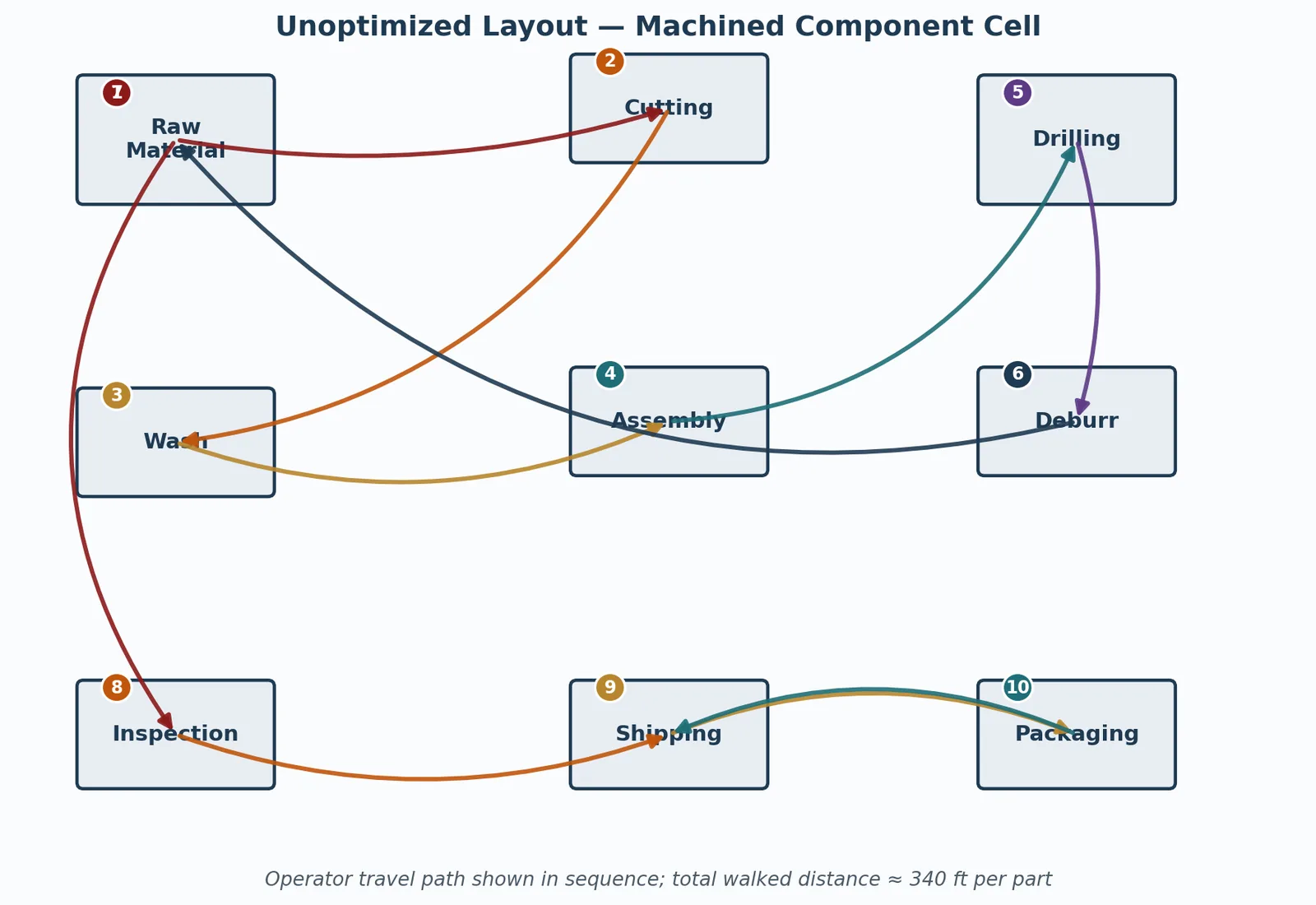
The current-state observation recorded roughly 340 feet walked per part. Across three shifts and about 200 parts per day, that became more than 12 miles of operator walking daily inside one cell.
Waste Patterns Identified
- Backtracking to raw material staging mid-cycle because staging sat between unrelated process steps.
- Crossing paths between drilling and deburring, even though the operations were sequential.
- A shared inspection station far from assembly and shipping, adding a long round trip near the end of every cycle.
The Redesign
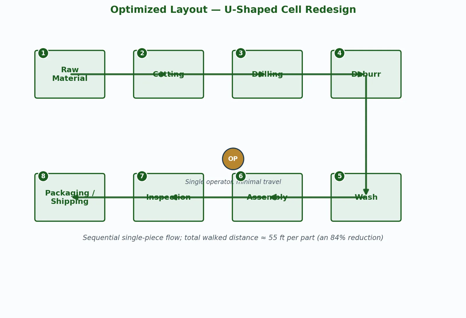
The team redesigned the area as a U-shaped cell, sequencing all eight stations in true process order and positioning the operator at the center of the U. After implementation, a follow-up observation using the same scope and method found a walked distance of about 55 feet per part: an 84 percent reduction.
Section 6: Application Across Environments
The tool originated on the manufacturing floor, but its logic applies anywhere a layout shapes how work happens: trace actual physical movement, measure it, and redesign around the pattern.
Manufacturing and Production Floors
Classic uses include operator travel within a cell, part travel between departments, forklift travel across a plant, shared tool cribs far from use points, and staging areas that force repeated round trips.
Healthcare
Nursing units, pharmacies, laboratories, and emergency departments are strong candidates because clinical staff time is expensive and directly tied to patient care. Repeated returns to nurse stations, supply rooms, medication rooms, and charting areas often become visible quickly.
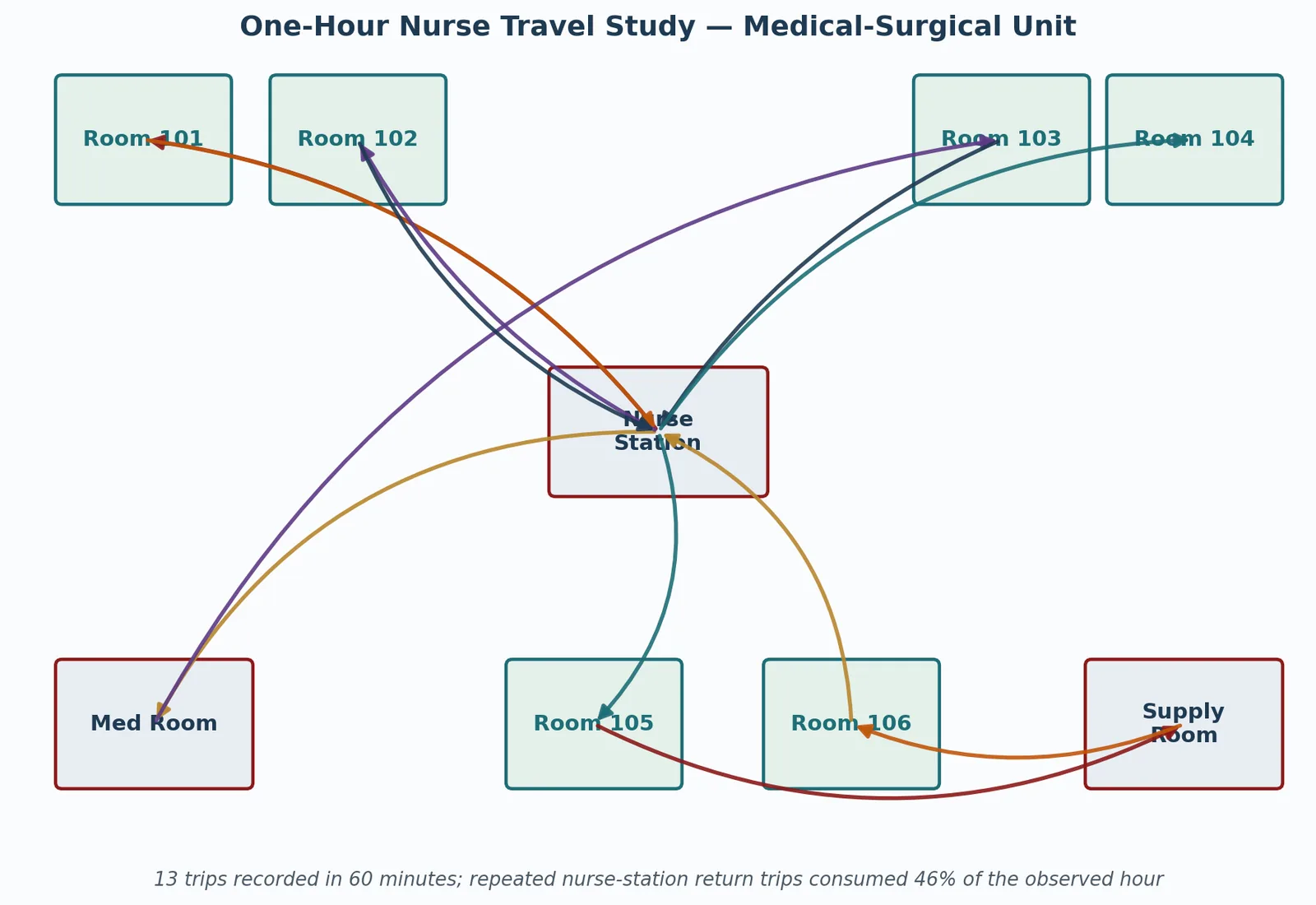
- Medication and supply rooms placed far from patient rooms create long, repeated trips.
- Repeated nurse-station returns often point toward mobile documentation or supply-cart solutions.
- Medication delivery paths can reveal delay and error risk from hurried, interrupted travel.
Office and Administrative Processes
For paperwork, approvals, shared equipment, or digital processes with physical handoffs, the path may be a document, person, file, or printer route.
- Shared printers or copiers placed far from their primary users are common quick wins.
- Sequential physical sign-offs may reveal opportunities to reorder approvals or digitize the handoff.
- Seating that separates people who collaborate constantly shows up clearly when foot traffic is traced.
Warehouse and Distribution
Picking routes, put-away paths, and cross-docking flows are natural subjects at a larger scale. Overlaying pick frequency onto traced routes often supports slotting changes, cart redesign, or a better pick-path sequence.
Section 7: Integration with the Lean Toolkit
A spaghetti diagram rarely stands alone. Its value often comes from how it connects to the other tools in the continuous improvement practitioner's kit.
| Tool | How It Connects to Spaghetti Diagrams |
|---|---|
| Value Stream Mapping | VSM identifies the process steps and handoffs that matter; the spaghetti diagram shows the physical layout reality behind them. |
| 5S / 7S | Point-of-use organization often shortens the paths a spaghetti diagram reveals. |
| Standard Work | The validated shorter travel pattern becomes part of the documented best-known method. |
| Kaizen Events | The diagram is useful during current-state observation and future-state report-out. |
| Time and Motion Study | Time studies add detail at a station while spaghetti diagrams show whole-cell travel. |
| Ergonomics Assessment | Long travel, carrying, awkward reaches, and repeated movement may require safety and ergonomics review. |
Section 8: Common Mistakes and Pitfalls
Data Collection Mistakes
- Diagramming the documented process instead of the observed one.
- Observing an unrepresentative cycle and treating it as typical.
- Announcing the observation in a way that changes normal behavior.
- Skipping the scaled floor plan and losing the ability to calculate distance.
Analysis Mistakes
- Stopping at the picture and skipping distance, time, and cost.
- Ignoring frequency: a rarely used long route may matter less than a short route traveled fifty times per shift.
- Treating every crossing line as equally important instead of prioritizing by total time, distance, risk, and frequency.
Implementation Mistakes
- Redesigning the layout without involving the people who work in it every day.
- Failing to re-diagram after implementation.
- Treating the new layout as permanent even as product mix, volume, staffing, and equipment change.
Quick Reference: Spaghetti Diagram Checklists
Planning Checklist
- Scope defined: specific subject and specific observation window.
- Objective stated: what decision will this study inform?
- Accurate, to-scale floor plan obtained or drawn.
- Notation convention selected and communicated.
- Observation timing chosen to reflect normal conditions.
Observation Checklist
- Actual movement traced, not the documented or assumed process.
- Every leg numbered in the order it occurred.
- Multiple cycles or shifts observed where practical.
- Time-and-purpose log kept alongside the visual trace.
- Observation conducted unobtrusively.
Analysis Checklist
- Total distance calculated per cycle, per shift, and per year.
- Time spent walking compared with total value-added cycle time.
- Backtracking, crossing paths, and long single trips identified.
- Findings mapped against the eight wastes where relevant.
- Quantified business case drafted with distance, time, and capacity impact.
Implementation and Validation Checklist
- Redesign developed with input from the people who do the work.
- Safety, ergonomics, and code requirements checked.
- New layout implemented and allowed a short settling-in period.
- After-diagram produced using the same scope, notation, and method.
- Results documented and folded into standard work.
Final Thoughts: Making the Invisible Visible
A spaghetti diagram is deceptively simple: trace where people and things actually go, and draw it on paper. That simplicity is its power. It requires no special software, no advanced statistics, and no elaborate setup, yet it consistently produces one of the most immediately persuasive pictures in the continuous improvement toolkit.
The discipline that turns a rough sketch into a real improvement tool is the same discipline behind strong Lean practice: observe what actually happens, quantify the waste in numbers a decision-maker can act on, involve the people who do the work in designing the fix, and validate the result with a second observation.
Sources & Further Reading
Gilbreth, Frank B. & Gilbreth, Lillian M. — Motion Study: A Method for Increasing the Efficiency of the Workman • Ohno, Taiichi — Toyota Production System: Beyond Large-Scale Production • Rother, Mike & Shook, John — Learning to See • American Society for Quality (ASQ) — asq.org • Institute of Industrial and Systems Engineers (IISE) — iise.org • Lean Enterprise Institute — lean.org
Spaghetti Diagram Frequently Asked Questions
Is a spaghetti diagram only for manufacturing?
No. It is common in manufacturing, but it also works in healthcare, offices, laboratories, warehouses, and any process where physical layout creates travel, searching, handoffs, or delays.
Do I need special software to make one?
No. A printed floor plan, clipboard, pencil, colored markers, and a stopwatch are often enough. Software can help later, but the value comes from direct observation.
What makes the diagram credible?
Credibility comes from a defined scope, direct observation, representative cycles, numbered path legs, distance or time calculation, and re-diagramming after changes to verify the improvement.
Apply This Next
Review the Spaghetti Diagram BoK Entry
Use the concise Body of Knowledge version when you need a quick definition, steps, and related tools.
Read the 8 Wastes Guide
Connect the movement patterns you observe to broader Lean waste categories and countermeasures.
Read the Value Stream Mapping Guide
Use VSM for the end-to-end process view, then use spaghetti diagrams to investigate the layout details behind flow problems.
Read Ergonomics in Kaizen
Make sure travel reduction improves safety and human performance instead of simply asking people to move faster.
Watch The Spaghetti Diagram
Use the companion video to review how movement mapping exposes motion waste and supports layout redesign.